
The numbers are still pretty small, but the latest data compilation from the National Renewable Energy Laboratory shows renewable electricity generation rising steadily in the United States. Here’s a key chart from NREL’s just-released Renewable Energy Data Book, which includes data through the end of 2013.
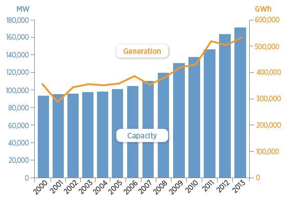
Capacity is the amount of total power that the various renewable sources could put out if operating at 100 percent. That’s indicated in the above chart in megawatts (MW). The amount of actual energy generated each year is indicated in gigawatt-hours (GWh). You’re probably familiar with kilowatt-hours, the unit of measure for monthly electricity use on your utility bill. The average U.S. residence uses 900 kilowatt-hours a month, and a gigawatt-hour is 1,000,000 kilowatt-hours.
There are five main sources of renewable electricity: hydropower, solar, wind, geothermal and biomass. This is how they break down:
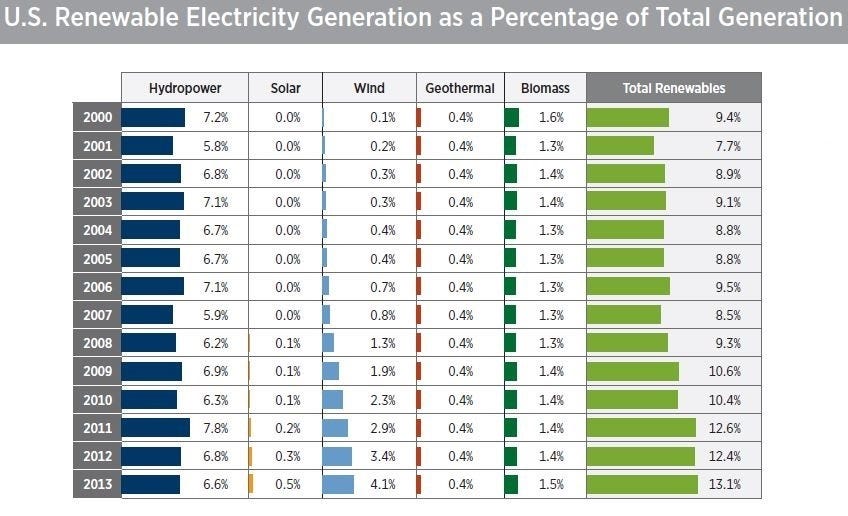
So if 13.1 percent of U.S. electricity comes from renewable sources, how do we generate the rest of it? Fossil fuels and nukes, mostly.

You can see that the most important shift since 2000 has been the steady move out of coal and into natural gas. In the renewables category, wind has been responsible for most of the increased generation. Here’s a closer look at how wind has grown over the past decade-plus:

As the chart indicates, wind capacity additions more or less paused in 2013, but new data shows wind bounced back well in 2014, so we should see the trend line continue to rise. How quickly will depend a lot on policy decisions in Washington, D.C., as well as in state capitals, but at this point, wind looks to be on a trajectory to overtake hydropower as the leading source of U.S. renewable electricity, perhaps by 2020. (There is some work being done to improve the efficiency of existing hydropower, but with no big capacity additions planned, hydropower generation will likely continue to fluctuate in its recent range depending on water supply.)
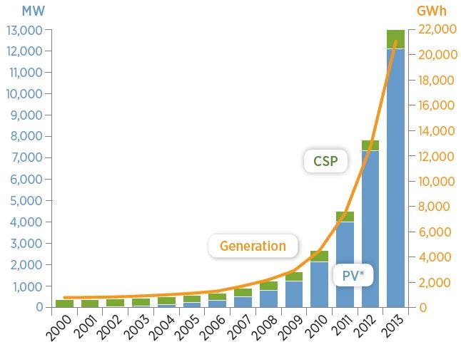
What about solar?
Solar has overtaken wind as the fastest growing source of electricity in the country — but remember, it started from practically nothing in 2000, and it’s really just been in the past six or seven years that solar has begun to show up in the larger picture. Here’s the solar chart for 2000 through 2013:
Those are the main story lines on U.S. renewable electricity generation — but you might be wondering how it compares to the rest of the world. As you can see below, we’re lagging, although mainly that’s because our proportion of electricity from hydropower is much lower than the rest of the world (6.6 percent in 2013 for the U.S. vs. 15.9 percent globally).
